It’s the Page Speed Load Time That Hurts Your Sales

McCordWeb.com Results

Continued from Monday.

Google says that as your site load speed increases from 1 to 7 seconds, your bounce rate increases 113%. Missed opportunities; bounced prospects means missed sales.

I tested my own website against a number of other sites on the Google Test My Site tool and here’s what I found.

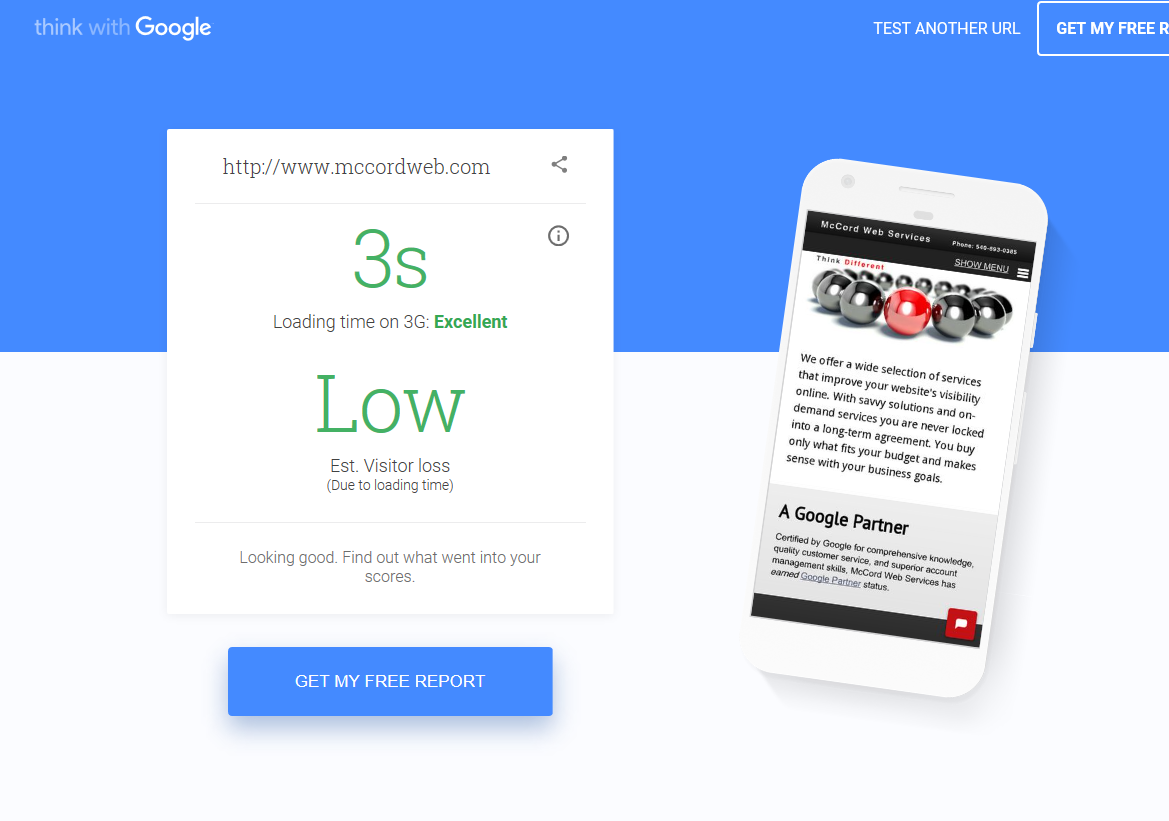
My site www.mccordweb.com – 3 second load, excellent rating, low loss of visitors. My site is a responsive design in PHP and only uses WordPress for the blog.

Fulfillment company legacy HTML website that is over 8 years old, but the owner is not ready to do an update yet. 7 second load time, fair rating, 26% estimated visitor loss.

Pest control company legacy PHP website that is over 10 years old, but the owner is not ready to do a site update yet. 6 second load time. fair rating, 24% estimated visitor loss.

Medical business redone responsive WordPress website, but the owner was not speed-focused. 7 second load time. fair rating, 26% estimated visitor loss.

GPS technology business newly redone responsive WordPress website with a very glitzy look, but the designer was not speed-focused. 10 second load time. poor rating, 29% estimated visitor loss.

What I have found is that the WordPress sites with the slide show on the home page are not testing well for speed. The PHP based websites that do not have a slide show cover and are more text focused and utilize created AMP pages are testing as speedy.

Need help with your website? Check us out to see how we can help you get a speedy rating and not risk visitor loss.


Is It Time to Go Build Your Responsive Website?

Confused senior man

Don’t Make a Big Mistake, Do Your Research!

Wow, Monday’s blog post was a bombshell! With AdWords saying that the use of DudaMobile redirect scripted sites being an advertising URL policy violation, sites that did not embrace the mobile sphere in April will now have to embrace going mobile in order to appear in AdWords ads. At least for now, until Google makes a decision on the redirect policy used by many.

So, what can you do if your website files now need to reside on your own server and you cannot utilize a redirect script for mobile?

  1. Move your website design to WordPress and use a mobile responsive website template.
  2. Consider doing away with your webhost and website files and move to a website template building service like WIX, Weebly, or even Duda.com. The tradeoff is that although you get a mobile version site, your regular website now goes away. Plus what you build there is not transportable to a new host.

Notice how either option is a rebuild/ redesign. There just isn’t a good quick fix to just create a mobile site and keep your old site too.

However here is one way to build a single mobile page with phone, directions and a short amount of content and link to visit your main site just for mobile complete with a mobile sensing script: http://buildinternet.com/2011/01/add-a-mobile-landing-page-to-your-site/ .

It is not glamorous, but gets your phone, directions and brief info into a mobile friendly format. For those AdWords advertisers that need to get rid of DudaMobile redirects, this may be a fast workaround until they have the budget to build a fully responsive website.

Remember, not embracing responsive at this point may not only mean that you cannot advertise on AdWords, but that you may have an organic penalty later too. I say it is simply time to move to a responsive design.

Want more information about our responsive website design services? Find out more here: http://www.mccordweb.com/web-design/index.php.

Late to the Mobile-Friendly Website Game? What to Do

Image of a responsive website on multiple devices.
Make sure you set the viewport for your site to display it properly on multiple devices.

If you are waited to update your website to be mobile-friendly and your traffic and business is crashing, know that Google means business in regards to transitioning to a mobile-focused world of search.

Over the last three months I have seen a huge shift even in AdWords conversions and for many clients all activity is now click to call from mobile devices. If you missed the boat and did not update your website to be mobile friendly by this week, here are a few quick things you can do to remediate that problem.

Some sites that you may want to check out if you are a do it yourselfer are:

DudaMobile – has mobile friendly as well as responsive designs.

WIX – just be careful of the design as not all are really responsive.

Shopify – has some nice designs to consider.

Webflow – is even a consideration.

Of course if you want greater control over your design and content, or simply do not have enough time to do this yourself, we have a very nice turnkey program for responsive websites for you to check out and try out online. Just let us know your interested and we’ll send you a link to over 50 super nice responsive starting points for your customized website.

Mobile Friendly Versus Responsive Website Design

Make sure you fully evaluate your options before buying a new website.

As more and more clients try to understand what it takes to please Google and smartphone users there are some items that should be carefully reviewed by all website owners before they put down a deposit on a new website.

First, there is a difference between a mobile-friendly website and a responsive website.

Second, my personal preference is a responsive website.

The difference is…

Mobile friendly – typically means that the site content is being rendered for a smartphone. DudaMobile sites are a good example of this as as Wix websites. A separate website is created for the mobile audience. What is problematic is that if your webmaster does not add content updates to your mobile site or forgets to click refresh the site at DudaMobile, your mobile content may not reflect the changes to your regular website.

Responsive website – this is the preferential way to build your new website. Here a stylesheet takes one set of content and renders that same content in different ways for the device’s screen width. The only potential issue for using this approach is that you do not have content control for mobile only as you do with a mobile friendly site. That being said, more often than not, readers do want to see your full content not a stripped down mobile version that may lack the depth of content and information that your desktop site contains.


Best Practices for Adding a Mobile Version Website

Google’s been pretty frank with webmasters in that it wants sites in its index to offer the best experience for all users and that means for mobile users too. In the algorithm that racks and stacks website, Google is looking to supply the very best site and one that is optimized for the viewing device.

That means if you do not have a mobile optimized website, you could be losing big traffic and big placement in the months to com. With smartphone use skyrocketing and mobile search activity eclipsing desktops and tablets, what’s a savvy website owner to do?

1. Move to a responsive website design. If you are looking to upgrade your website design, make sure you are planning for the future by embracing a responsive site design. This means that code that renders the page renders different page layouts based on the size of the device screen. Using JavaScript and Cascading Style Sheets (CSS) the same exact content seen with a desktop is automatically reformatted to fit the screen of a smaller device.

2. If you cannot or will not move to a responsive website design for budget reasons or your site is still not “old” or “tired” then make sure that you are using a mobile site “bandaid” tool. Use something like www.DudaMobile.com to create a mobile friendly design for your website now. If you do this, make sure to watch this video from Google’s Matt Cutts to follow Google’s best practices.